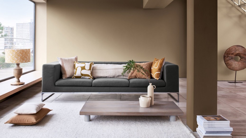
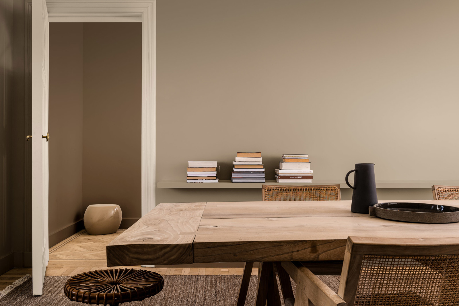
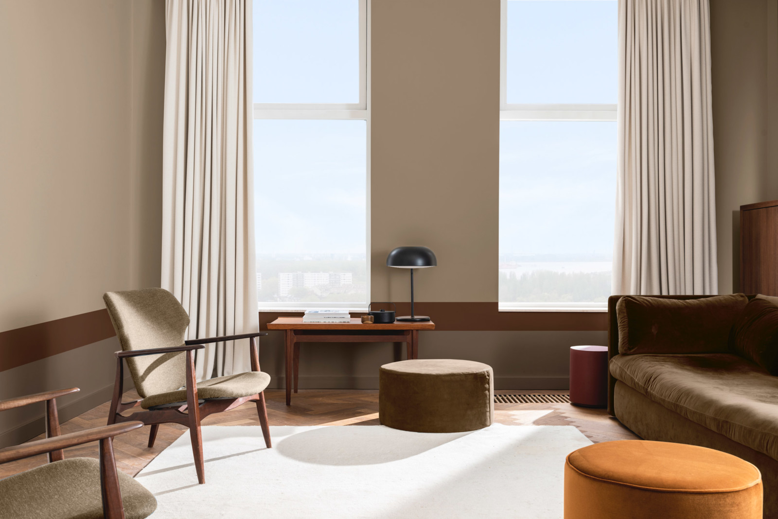
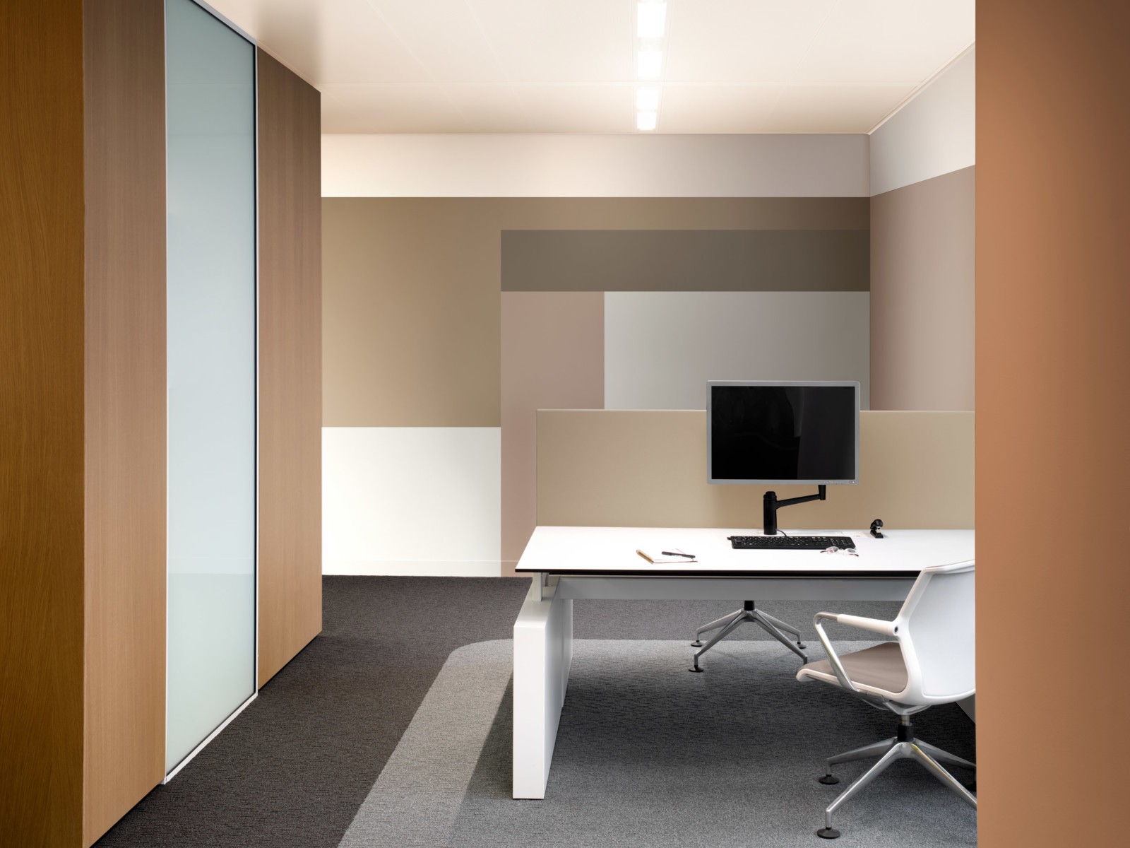
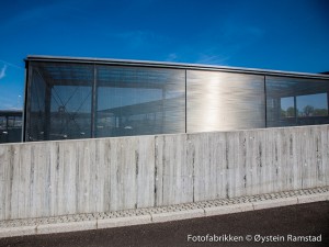
Paint brand Dulux has unveiled a “reassuring” earthy beige hue called Brave Ground as its colour of the year for 2021.
Brave Ground was selected as an “elemental” hue that reflects “the strength we can draw from nature, our growing desire to align more with the planet and looking towards the future” – particularly in a world still dealing with the challenges of the coronavirus crisis.
Dulux decided on the shade after months of working with paint company AkzoNobel, and a roster of trend forecasters, design specialists, editors and architects from across the globe.
油漆品牌多樂士(Dulux)推出了一種“令人放心的”土黃色米色,稱為Brave Ground,作為2021年的年度顏色。
勇敢的地面被選作一種“基本”的色調,反映出“我們可以從自然中汲取力量,我們與地球更加融合併展望未來的不斷增長的願望” –特別是在仍在應對冠狀病毒危機挑戰的世界中 。
經過與塗料公司AkzoNobel以及幾個月的趨勢預測者,設計專家,編輯和建築師的合作,Dulux決定了陰影。
“As a result of the global pandemic many people’s priorities are shifting significantly, to focus much more on their well-being,” explained creative director of Dulux UK Marianne Shillingford.
“Colour can play a significant role in this – and with the calming, restorative and natural tones of our ColourFutures 2021 palettes we hope to empower professionals to create spaces where occupants can reflect, recharge and recalibrate.”
Dulux UK創意總監瑪麗安·希林福德(Marianne Shillingford)解釋說:“由於全球大流行,許多人的工作重點正在發生重大變化,以更加關注自己的福祉。”
“顏色可以在其中發揮重要作用-並藉助我們的ColourFutures 2021調色板的鎮定,恢復和自然色調,我們希望使專業人士能夠創造空間,使乘員可以反射,充電和重新校準。”
“The past year has seen how we live and work utterly transformed,” added Heleen van Gen, head of AkzoNobel’s Global Aesthetic Centre in the Netherlands.
“We have gone through the most uncertain of times, so it’s understandable that we see reassuring, natural tones returning, which can be used to create the calm and sanctuary people require.”
荷蘭阿克蘇諾貝爾全球美學中心負責人Heleen van Gen補充說:“過去的一年見證了我們的生活和工作方式發生了徹底的變化。”
“我們經歷了最不確定的時期,因此可以看到令人放心的自然色調回歸,這可以理解,可以用來創造人們所需要的平靜和庇護,這是可以理解的。”
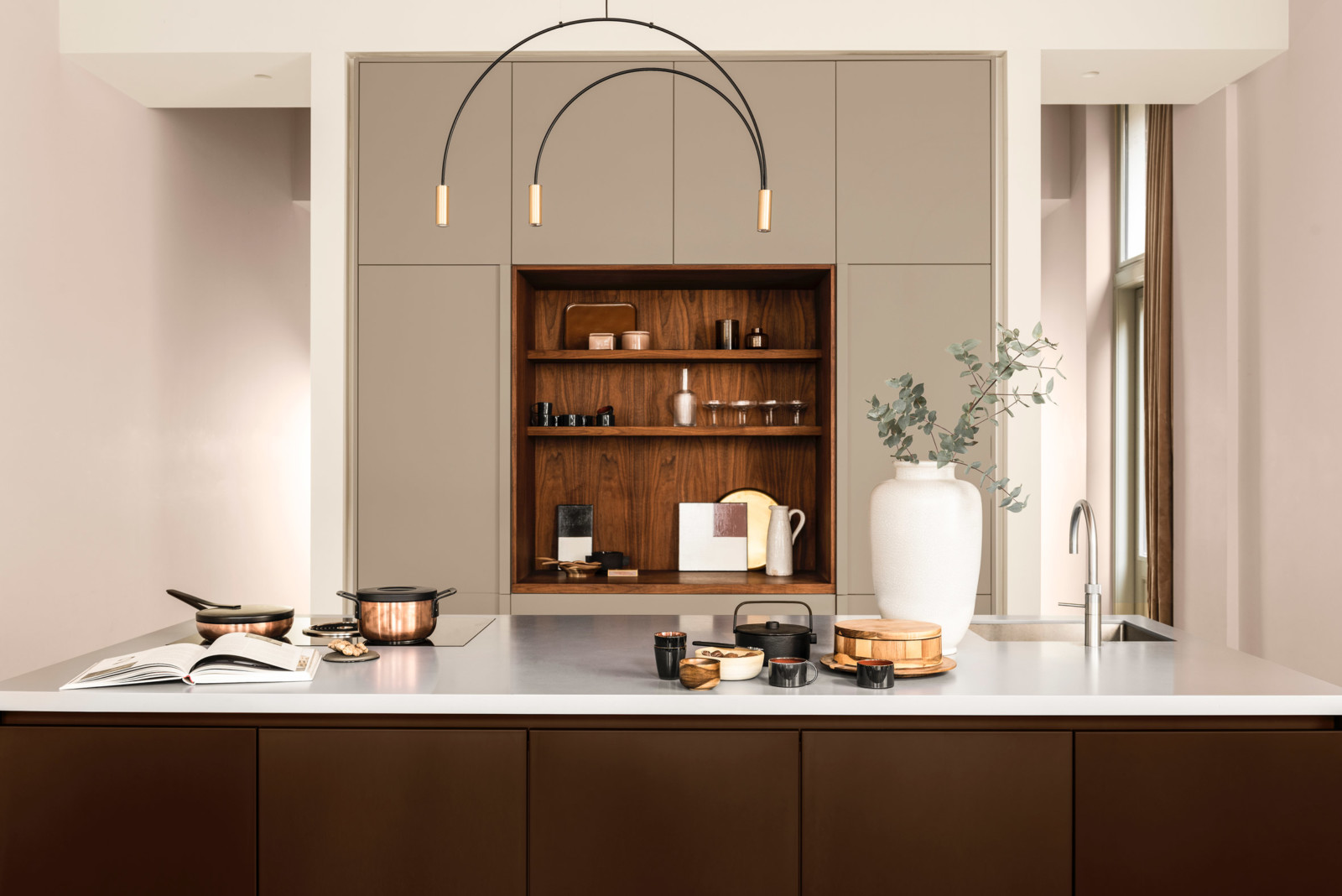
As well as offering a sense of tranquillity, Brave Ground is also intended to be a versatile colour that can be applied to a variety of different settings. Shifting in tone throughout the day, the colour creates what Dulux and AkzoNobel describe as “subtly responsive environments”.
The two companies have additionally developed a handful of complementary colour palettes that can “sit comfortably” alongside Brave Ground – among them is Expressive, a collection of striking reds and pinks, and Timeless, a warm group of yellows and ochres.
除了提供寧靜感外,Brave Ground還旨在成為一種通用顏色,可以應用於多種不同的設置。 顏色全天變化,顏色創造了Dulux和AkzoNobel所說的“靈敏的環境”。
兩家公司還另外開發了一些互補的調色板,這些調色板可以與Brave Ground一起“舒適地坐著”-其中包括Expressive,一組醒目的紅色和粉色,以及Timeless,一組溫暖的黃色和色。
Brave Ground is slightly more muted in appearance than Tranquil Dawn, a cool-green shade that Dulux selected as its colour of the year for 2020.
At the time of its unveiling, interiors writer and former ELLE Decor editor-in-chief Michelle Ogundehin said in an opinion piece for Dezeen that the paint brand “could have been bolder” and opted for a stronger hue that more acutely reflected mounting global unrest.
American company Pantone is yet to announce its 2021 colour of the year – last year it chose Classic Blue, a “universal favourite” hue that is meant to “brings a sense of peace and tranquillity to the human spirit”.
勇敢的地面在外觀上比寧靜的黎明略微柔和,後者是杜勒克斯(Dulux)選為2020年度顏色的冷綠色陰影。
在揭幕之時,室內裝飾作家兼前ELLE Decor主編Michelle Ogundehin在Dezeen的觀點文章中表示,塗料品牌“本來可以更大膽”,並選擇了更強烈的色調,以更加敏銳地反映出全球動蕩的加劇。 。
美國公司Pantone尚未宣布其2021年的顏色-去年,它選擇了Classic Blue,這是一種“通用的”色調,旨在“為人類精神帶來和平與安寧感”。
FROM:https://www.dezeen.com/2020/09/08/brave-ground-dulux-colour-year-2021/
